

ITERATION
SYNTHESIS
PROCESS
RESEARCH
SUMMARY
TIMEFRAME
2 WEEK SPRINT
TEAm
3 UX DESIGNERS
ROLE
UX GENERALIST
TOOLS
SKETCH, INVISION, DOCS
Wealthly is a financial literacy + coaching app created for financial coach LaToya Westbrooks. After an in depth onboarding process in which the user is introduced to LaToya and then learns about their financial goals the user then gains access to a financial course where they can increase their financial literacy in the area they feel weakest. Users of Wealthy are assigned personalized tasks by LaToya and can talk to her via an in-app chat.
THE PROBLEM
Our client for this project is LaToya, a financial coach who was running a successful business helping millennials with poor money habits. Latoya was able to help all of her clients achieve a higher level of financial literacy, however she was reaching a point where she didn’t have the time to take on any more new clients. We wanted to create an app that helped our client scale her financial coaching business by reaching more potential clients in less time.
RESEARCH
PAST CLIENTS
We knew that our client was able to maintain a successful financial coaching business with repeat customers. What we were unsure of was why. There are many financial services available to help those who aren’t confident managing their money. What brought clients to LaToya? and more importantly, What kept them coming back? To answer these questions we interviewed several of LaToya’s past clients about their experiences with her. What we learned:

PROSPECTIVE CLIENTS
As you can see LaToya didn’t have an issue retaining her clients. We set out to find how we could create an app that would expand her reach by bringing in clients who had not previously considered hiring help with their finances. We spoke to 9 potential users who fit LaToya’s targeted age and income bracket but had never sought out financial help . We wanted to learn more about how they learn about their finances and their preferred learning methods.


Our affinity map
PERSONA
Taking everything we learned in our research we created a persona to guide us though our designs and ideations . Frankie is a 29 year old who was just promoted at her job and received a considerable raise. Frankie wants to learn how to invest her new income wisely but she doesn't know where to start.

USER JOURNEY
To help us identify the best area of opportunity in the pain points that Frankie faced we created a journey map describing the process of her trying to learn how to invest. The jagged line represents Frankies emotional ups and downs. My team and I decided that our strongest area of opportunity is when Frankie downloads Stash, is confused, and ends up placing her earnings in her savings account, discouraged when she doesn't get a significant return.

Frankie's User Journey
THE PROBLEM
Frankie is an intelligent woman who is capable of learning on her own with proper support, however she was not able to confidently handle her new income. We asked ourselves, how might we empower Frankie to feel more confident with her money so that she can invest it wisely rather than putting it in her savings account?
ITERATION
FEATURE PRIORITIZATION
My team and I used a method called MoSCoW mapping to plot our necessary features. You create a matrix with the axes being high effort and low effort, high impact and low impact. You then plot each feature on the matrix. The first quadrant is your Must features, followed by Should, then Could, and finally Won’t (for this iteration at least). From here you can figure out with features are necessary in your MVP (minimum viable product) and focus on those. The bolded features on our map are the ones we chose to focus on.

MoSCow Map
PAPER PROTOTYPE
After completing a design studio focusing on the features in our MoSCoW map we created a paper prototype. To make sure that we created something that was both intuitive and useful for our users.
-
4 / 5 users were able to complete a task LaToya assigned them and complete the first level of a course on investing.

Paper prototype
MEDIUM FIDELITY TESTING
Encouraged by our paper prototype testing results we brought our designs into sketch and created a prototype using InVision. When we tested our prototype on a new batch of users it performed completely different.
-
3 / 5 users were not able to locate the investing course. Most users felt the progress button did not look clickable.


PIVOT
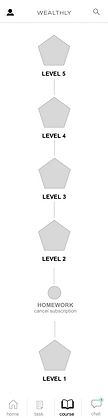
We re-thought the layout and decided that Frankie (our persona) would like a more visual representation of her learnings. So we designed a new ‘task’ page where the user would be able to see their tasks and course work in a more liner fashion.
-
4 / 5 users were able to navigate to courses and complete tasks assigned to them from the new task page.

HIGH FIDELITY
Onboarding
From our research we knew that LaToya’s relatability was a key factor in what kept her customers coming back. To incorporate this into the Wealthly app we decided to start off with an onboarding that would introduce the users to LaToya.

The Features

FINAL THOUGHTS
While we chose to focus on Investing for the sake of our prototype and testing , this app acts as a template for our client, allowing her to build many different courses for her users to take, educating them on any subject of her choosing. It also allows for scalability in that there is definitely the opportunity in the future for our client to add more coaches onto the platform. In the future we would like to develop various tiers, payment options and corresponding content restrictions.
